01 / 06
Foundations & design tokens
Colour, type, spacing, radius, elevation and motion kept as tokens in one source and exported to each platform.
Tokens · one source
System Design
We build design systems for product and engineering teams: tokens, components, patterns and documentation, in Figma and in code. Tokens and components are versioned and published from your own repositories.
Illustrative diagram: three tokens feed four components, which make up three patterns used on web, iOS and Android. Choosing a part highlights everything that inherits it.
What we offer · 6 parts
Tokens and components are defined once and reused across every product, including new patterns such as AI answers.

Colour, type, spacing, radius, elevation and motion kept as tokens in one source and exported to each platform.
Components built once with their states, keyboard behaviour and ARIA, published as a versioned package and documented in Storybook.
Several brands, products or markets themed from one component set, with each difference held in tokens.
Focus order, target size, contrast and screen-reader behaviour solved in each component, so every team using it inherits the fix.
Usage guidance with dos and don’ts, plus a reviewed way for teams to add components, so the system grows with the product.
Semantic versioning, deprecation notices, automated code upgrades where they help and an adoption measure for each product team.
How it works
We build the system from the screens you already have, so the first release covers most of your product.
We inventory every screen and component, merge duplicates and separate accidental inconsistencies from deliberate ones.
Gate · Do we know what exists today?
Design and engineering agree tokens, naming, structure and the first components, with accessibility acceptance criteria for each component.
Gate · Have product teams agreed the foundations?
We build the Figma library and code package together, document them in Storybook and run visual regression and accessibility tests on every change.
Gate · Is every component documented and tested?
One pilot team moves first, then the rest, with office hours, a contribution path and an adoption measure per team.
Gate · Are teams building new screens with it?
Timings are typical and shorten when the evidence already exists.
Change impact · what you will see
A sample release note: the components that inherit each change and the visual regression result, checked before it merges.
| Token change | Button | Input | Card | Dialog | Visual diff |
|---|---|---|---|---|---|
| color.action.primary · contrast 4.1 → 4.8 | Inherits (Passes) | Inherits (Passes) | — | Inherits (Passes) | 38 snapshots · approved (Passes) |
| radius.control · 6 → 8 px | Inherits (Passes) | Inherits (Passes) | — | — | 24 snapshots · approved (Passes) |
| space.stack.md · 16 → 20 px | — | Inherits (Passes) | Inherits (Passes) | Override (Watch) | 1 unexpected · Dialog (Fails) |
| focus.ring.width · 2 → 3 px | Inherits (Passes) | Inherits (Passes) | Inherits (Passes) | Inherits (Passes) | 52 snapshots · approved (Passes) |
What you get
What we make for you is yours once it is paid for. Tools we already had stay ours, and you get a free, permanent licence to use them.
/handover/05-systems/
/handover/README
What changes
We track screens built from system components, accessibility fixes made at component level and teams on the current version. Baseline, target and data source are agreed in week one.
Common screens use components that already include their states, keyboard behaviour and accessibility.
A contrast or focus bug is fixed in the component, and every product using it gets the fix.
We measure adoption per team, and a contribution path makes joining in cheaper than working around it.
The stack
Design, component, testing and release tools, with tokens kept in one source and exported to web, iOS and Android. We work with these technologies; no partnership is implied.
Frameworks we build to
Each component is built and tested to these standards, so every screen that uses it starts from the same baseline. Listing a standard is not a claim of certification.
Perceivable, operable, understandable and robust content, including 2.2 criteria such as focus not obscured, target size and accessible authentication.
How we apply itContrast, focus order and target size checked in the design file, then keyboard and screen-reader tests on every key journey before sign-off.
Good at the 75th percentile of page loads: LCP ≤ 2.5 s, INP ≤ 200 ms, CLS ≤ 0.1.
How we apply itLCP, INP and CLS budgets set per template in the design spec, then checked at the 75th percentile of visits after release.
Requirements for a quality management system built on process control, risk-based thinking and continual improvement.
How we apply itEvery stage ends at a written gate with an owner, and design QA checks the build against the approved design before sign-off.
Services & packages
Commission the foundations, the component library, the documentation or the whole system. Design and code are delivered together, so the Figma library and the live product stay in step.
How to buy
How we work with you
Ask a quick question, send a project brief or issue a formal RFQ. The lead for the work reads each one in full, and any services already in your brief go with it.
Or book a thirty-minute call01
For a first conversation, a press request or anything that does not need a scope yet.
You get A reply from a named lead
02Recommended
Goals, audiences, a budget band and timing, so our first reply can outline the work.
You get Options and a first scope after one call
03
Your documents, deadlines and the procurement and security rules the work must meet.
You get Receipt confirmed and a named bid lead
How it is priced
Each package shows its pricing model. Work starts once a written scope and quote are agreed.
Opens a project brief with this package chosen.
In your brief
In your brief
In your brief
In your brief
| Package | Every engagement includes | Best for |
|---|---|---|
| ProjectA defined scope, delivered for a fixed price. |
|
Work you can describe up front: an identity, a platform or a set of tools |
| MilestoneA larger build in phases you approve and pay for one at a time. |
|
Programmes too large for one contract, where you want control at each step |
| RetainerReserved monthly capacity to run, improve and extend what we built. |
|
Live brands and products that need a steady team without hiring one |
| SquadA dedicated team that works inside your stack and sprint schedule. |
|
Teams with a clear roadmap that need more senior people quickly |
Questions
Anything else goes to the people who would do the work.
Start a briefBrand Systems sets the rules; System Design makes them buildable in products. Brand Systems covers expression, assets and tone on every channel. System Design covers your product’s tokens, components, states and versioning, in Figma and in code.
Only once several teams or surfaces must look and behave the same. If one team builds one product, a small pattern kit is enough. A system also pays off when the same accessibility fix keeps being made in several places.
Both: a design system needs the Figma library and the code package. A Figma library alone soon falls out of step with the live product. One token set links the two and is exported to each platform.
Usually React with TypeScript, with tokens exported for iOS and Android. Web components are an option when several frameworks must share one library. We choose to fit your products.
Your team, or ours on a retainer while your in-house team forms. Your team takes over with a named owner, a contribution path and documentation. Either way, the versioning, release and deprecation process is part of the handover.
Related capabilities
Experience Design builds journeys from the library; Consulting decides where to adopt it first.

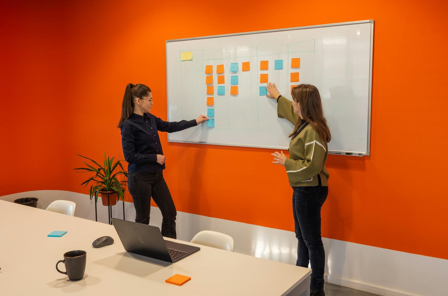
You will speak to a lead who would run the work, and get a straight answer on fit.
Three ways to start
Every engagement starts with a written scope and a quote agreed before work begins.
Choose one of the three ways above