

What we do

@yourbrand/systemv2.4.0Flex without breaking

Rules for a brand that keeps moving.

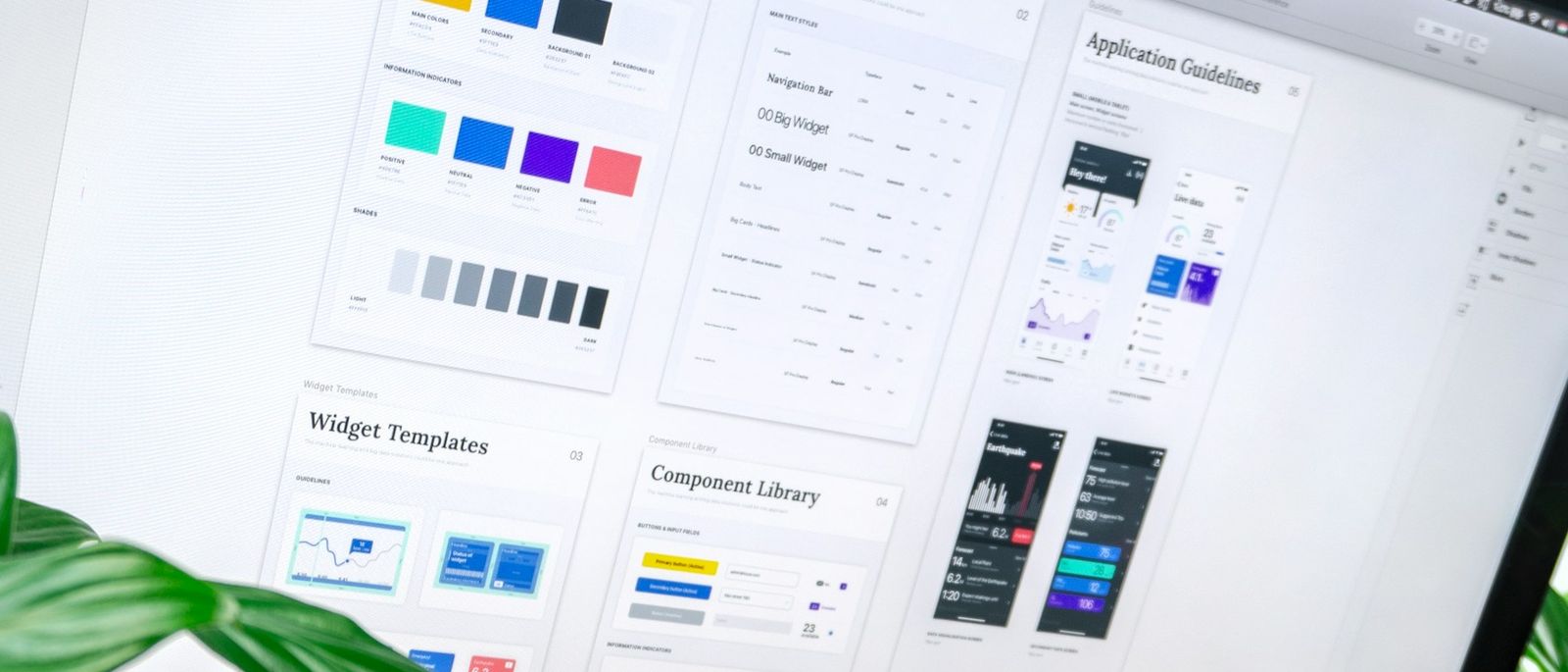
Brand Systems are the rules for how a brand flexes and adapts without losing what makes it recognisable. Tokens, components and templates that let every team ship on brand at speed.

Typical length
6–12 weeks
Scope
Tokens · components · templates
Release
Versioned
Built on
Tokens → components → templates → channels

Illustration: a design token such as the primary colour or corner radius changes, and the change flows through the components, templates and channels built on it, each re-rendering in turn.

02/signature/token-editor

Change one value. Watch every touchpoint follow.

This is the system working the way yours will. Pick a primary colour, a corner radius, a type scale and a density. Six real components re-render, the tokens export in three formats, and an agent reports what changed and what now fails contrast. A person still approves the release.

tokens / your-brand.json branch proposal/primary Autoplaying · touch any control to take over
color.primary
type.ratio
space.unit

Exports
tokens.css · tokens.json · tokens.dtcg.json
Read by
web app · email CMS · slide templates · social kit
Merge
proposal/primary → main · nothing to merge

Agent · impact report0 changes

    Contrast · WCAG 2.2

      People decideThe agent flags; the system owner approves the release, or sends it back.

      03/what-we-build/manifest

      One source. Every team.

      Product, marketing and communications read from the same tokens, so the button in the app and the call to action in an email inherit the same rules. Six packages make up the system. Each one is versioned, and each one names what it depends on, so nobody has to guess what a change will touch.

      system install @yourbrand/system

      1. Design tokens

        Colour, type, space, radius and motion as named values. One source, exported to design tools and code.

        One source

        No dependencies · the root

      2. Component library

        The parts every touchpoint is built from, designed once with their states and rules. Product, marketing and comms share them.

        Shared parts

        Requires tokens

      3. Templates & layouts

        Landing pages, decks, email, social, print. Templates that take content and stay on brand without a designer.

        Content in · on brand out

        Requires tokenscomponents

      4. Flex rules

        How far the brand can stretch for a campaign, a market or a sub-brand, and where it stops. Written as ranges, not opinions.

        Ranges · not opinions

        Requires tokenstemplates

      5. Governance & versioning

        Who can change what, how a change ships, and how every team knows which version they are on.

        v2.4 · locked

        Requires tokenscomponentstemplatesflex-rules

      6. System documentation

        A living site that shows the system in use, with code and design side by side. Searchable, current, owned by you.

        Living site

        Requires componentstemplatesflex-rulesgovernance

      6 packages · one source of truthSelect a package to trace what it depends onVersions illustrative

      04/flex-rules/ranges

      Ranges, not opinions.

      Every element gets a floor and a ceiling. Inside the band, a campaign, a market or a sub-brand can stretch without asking. Outside it, the change goes to the system owner. Drag a marker, or load a brief, and the rule answers.

      Load a brief

      4 of 4 in rangeShips without review

      1. 01 · Blue coverage of the surface

        Blue leads, paper carries. Accents may grow for campaigns.

        In rangeInside the band. Ships without review.

      2. 02 · Display size against body

        Outfit display, Montserrat reading. Scale may grow, never flatten.

        In rangeInside the band. Ships without review.

      3. 03 · Crop and treatment

        People at work, natural light. Crops may tighten, subjects stay.

        In rangeInside the band. Ships without review.

      4. 04 · Departure from the 12-column grid

        Twelve columns. Campaigns may break the grid on one element per view.

        In rangeInside the band. Ships without review.

      Bands illustrativeThe agent measures each asset against the bands before it ships. People decide every exception.

      05/audit/component-inventory

      Find the duplicates. Keep one of each.

      Most brands already have a component library. It is just spread across files, agencies and markets, with a slightly different button in each. The audit finds every near-duplicate, and the system keeps the few that earn their place.

      Variants
      92
      Retired
      0
      Source
      7 files · 3 agencies

      Showing the audit: 92 component variants found.

      Buttons

      23 found23 → 3

      Inputs

      14 found14 → 2

      Cards

      19 found19 → 4

      Badges

      11 found11 → 2

      Email headers

      9 found9 → 1

      Social tiles

      16 found16 → 3

      AgentClusters near-duplicates by look, props and where they are used, and proposes a canonical for each cluster.

      PeopleDesigners and engineers choose the canonical, name it, and decide which differences are real variants.

      Counts illustrative

      06/templates/channels

      Content in. On brand out.

      A template holds the rules so the person filling it does not have to. Write the content once; each format lays it out its own way, drops what it cannot carry and warns when a line will not fit. Type a headline and switch formats.

      content.json

      eyebrow
      Spring range
      body
      Three ways teams use Product C in the first month.
      cta
      Book a demo
      image
      hero / pattern-04
      market
      M03 · en-GB

      Rules this template enforces

      • Single column, 600 px wide
      • Image above the headline at 2:1
      • Headline up to two lines
      • Legal line pulled from the market pack

      07/governance/releases

      Who changes what, and how everyone finds out.

      A system without governance drifts back into a folder of files. Changes are proposed, reviewed and released with a version number that says how much they break, and every team chooses how closely it follows.

      Watch releases

      Watching minor and major releases · 4 of 6 shown would notify you.

      1. v2.5.0-rc.1 minor

        In review

        Brighter primary for campaign surfaces

        • Addedcolor.primary.bright, campaign templates only
        • Changedbutton.primary label weight 500 → 600
        1. Proposed
        2. Agent checks · 2 contrast flags
        3. Maintainer review
        4. System owner
        5. Released
      2. v2.4.0 minor

        Illustrative · Q3

        Density tokens

        • Addedspace.density compact, default and comfortable
        • Deprecatedspacing.sm, use space.2 · removed in 3.0.0
      3. v2.3.2 patch

        Illustrative · Q3

        Focus and safe areas

        • FixedFocus ring visible on ink surfaces
        • ChangedSocial tile safe area 64 → 72 px
      4. v2.0.0 major

        Illustrative · Q1

        Tokens renamed to category.role

        • Breakingcolor-blue is now color.primary
        • BreakingCard drops the legacy shadow prop
        • AddedCodemod and a six-week overlap for migration
      5. v1.4.0 minor

        Illustrative · Q4

        Email and market packs

        • AddedEmail header template with three slots
        • AddedMarket 03 locale pack
      6. v1.0.0 major

        Illustrative · Q3

        First release

        • AddedToken set, core components and the first templates

      08/documentation/system-site

      A living site, not a PDF.

      The documentation shows the system in use, with design and code side by side and the owner of every page named. It is searchable, versioned with the releases, and yours to run. Search it below.

      A small team gathered around a monitor, one person pointing at the screen
      Design and engineering, one page each

      Your brand system

      Components / Button

      Button

      The main action on a surface. One primary per view; secondary and text buttons for everything else.

      <Button variant="primary">Book a demo</Button>
      • DoUse one primary button per view.
      • Don’tSet label text below 4.5:1 contrast.

      Owner · Design systems leadUpdated in v2.4.0

      09/how-it-runs/pipeline

      A build pipeline, not a big reveal.

      Tokens first, because they remove most of the drift. Components and templates follow where they ship most often. Each phase only closes when its artefacts pass review, the same way code only ships when its checks go green.

      pipeline brand-system / main

      All 4 stages passed · v1.0 tagged

      1. stage 1/4

        passed

        Audit

        Wk 01–02

        Every touchpoint you have. Where the brand drifts, what gets rebuilt by hand, what costs the most to keep consistent.

        • Touchpoint auditpassed
        • Drift reportpassed
        • System scopereviewed

        Gate · sign-off before stage 2

      2. stage 2/4

        passed

        Foundations

        Wk 03–05

        Tokens defined and exported. The core components designed with states, then built where they live.

        • Token setpassed
        • Core componentspassed
        • Code exportreviewed

        Gate · sign-off before stage 3

      3. stage 3/4

        passed

        Extend

        Wk 06–09

        Templates for the touchpoints that ship most often. Flex rules tested on a live campaign or market.

        • Template setpassed
        • Flex rulespassed
        • Live testreviewed

        Gate · sign-off before stage 4

      4. stage 4/4

        passed

        Run

        Wk 10–12

        Documentation, governance and a release cadence. The team trained and the first version tagged.

        • System sitepassed
        • Governancepassed
        • v1.0 releasereviewed

        Gate · system owner tags the release

      10/deliverables/release-bundle

      What you receive, versioned together.

      Everything ships as one release. Tokens, components, templates, rules, governance, documentation and the notes all carry the same version number, so design, code and the guidelines never disagree about which brand is current.

      Artefacts
      7
      Version
      1.0.0
      Owned by
      You

      @yourbrand/systemv1.0.0bundle

      Release bundle v1.0.0: artefact, formats, version, hash and owner
      ArtefactFormatsVersionHashOwner
      Design tokens JSONFigma variablesCSS 1.0.0 f0ec682 Design systems lead
      Component library Figmacode 1.0.0 b35a006 Design systems lead
      Template set FigmaOfficeCMS 1.0.0 e2825b6 Content lead
      Flex rules & ranges Guidelines 1.0.0 2325d9b Brand lead
      Governance model Document 1.0.0 7e87f11 System owner
      System documentation site Web 1.0.0 d818e00 Design systems lead
      Release notes & versioning Changelog 1.0.0 d9f825f System owner

      7 of 7 artefacts match v1.0.0Hashes illustrative

      11/outcomes/adoption

      Measured by use, not by launch.

      A system works when teams build with it. We track the share of assets made from system parts, team by team and channel by channel, and we read the gaps as the next piece of work.

      Assets built from system parts Illustrative

      Share of assets built from system parts at month 12, by team and channel. Illustrative.
      TeamAppWebEmailSocialSlidesPrint
      Product 96 92 70 40 62 20
      Marketing 60 90 94 88 80 72
      Communications 30 76 86 82 90 66
      Market 01 58 84 88 90 74 70
      Market 02 44 72 80 84 66 62
      Market 03 40 70 78 86 60 58
      Agency A 18 66 74 80 52 44
      A team gathered around a laptop in an open office, talking through what is on screen
      Adoption review · Market 03

      12/reference/questions

      Questions teams ask before they start.

      Filter by topic or search. If your question is not here, it is a good one to bring to the first call.

      7 questions

      It includes one. A brand system covers product, marketing and communications with one set of tokens, so a button in the app and a call to action in an email inherit the same rules.

      It helps. Tokens export to Figma variables and to code. We work in your stack, whatever it is.

      Your team, with a governance model and a release cadence we set up together. We can stay on as the system’s editor if you want us to.

      Yes. Tokens alone remove most of the drift. Components and templates follow when you are ready.

      One source file exports to CSS variables, JSON and design-tool variables on every release. Nobody copies values by hand.

      It asks inside the flex ranges first. If the need sits outside them, it becomes a proposal, and the system owner decides whether it joins the system or stays a local exception.

      Agents check assets against tokens, ranges and contrast, cluster duplicates in audits and draft release notes. People review what they flag and make every decision that ships.

      Let’s build what happens next.

      Tell us what you’re building. We’ll answer straight.

      Book a discovery call